trip planning made easy
-
trip planning made easy -
Background Information
ChargeHub is a network-independent EV charging application, in which users are able to navigate to stations, pay for and activate charging sessions for their electric vehicles. In this project I will detail how we at ChargeHub learn, build, and measure continuously to deliver an effective end experience for our users.
Trip Planner
The trip planner on the ChargeHub app functions as the navigation portion of the product, allowing users to plan their EV trip, charging stations included, well in advance.
The Problem
App users are struggling to understand how to navigate the Trip Planner, resulting in extensive customer service requests and poorly constructed saved trips.
The Process
After identifying that we have a problem, we at ChargeHub focus on learning as much about the problem as we can. Generating some understanding of our audience and how the current configuration of our assets is causing an issue for them.
Process in Practice
Personas
We have established user profiles from years of research and industry standards in the EV space.
Prototyping & Testing
In our search for a solution to this problem, we wanted to clarify it further by testing the existing construction of the trip planner. Using the app itself, we conducted a test using User Brain.
Findings: Users have a hard time understanding how to construct a trip. Everything from adding a stop to your trip to saving a trip, each item was a possible blocker for testers as they progressed through the trip planner experience
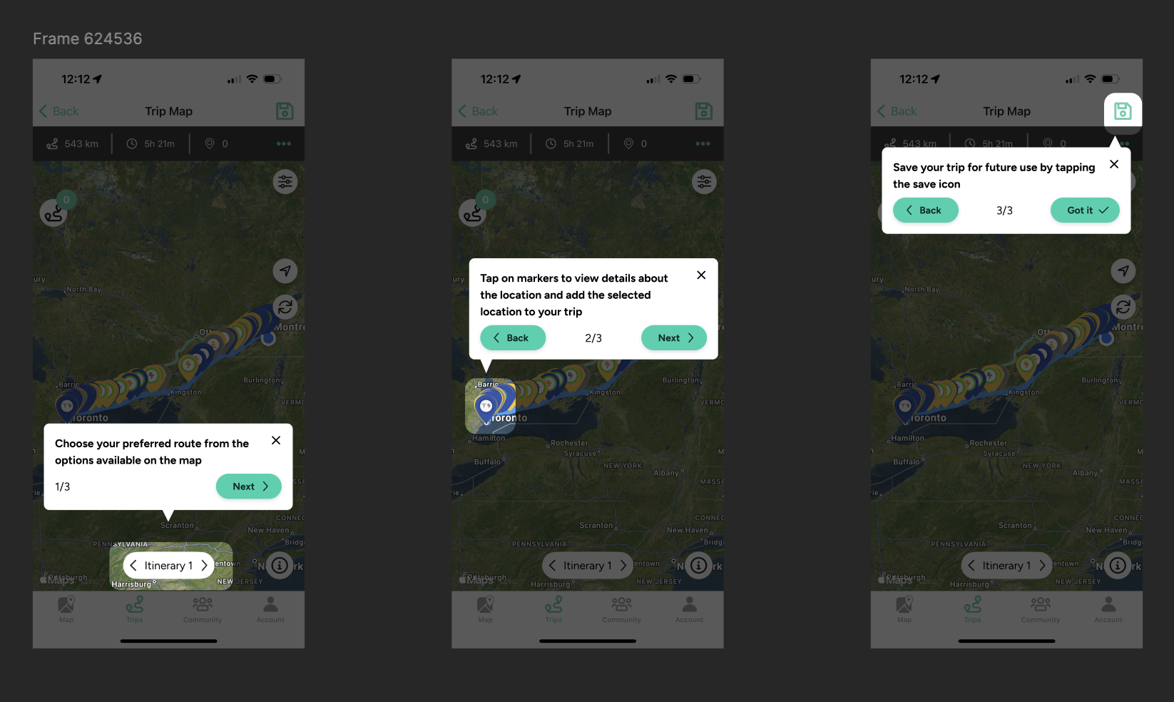
Upon acquiring these discoveries, we created a primary solution - a help tool that introduces the pieces of the trip planner upon first entry into the tool. This was re-tested using the same platform and same prompts
Re-tests revealed that users were still struggling to understand both the “Add to Trip” function and the “Save Trip” function. In the initial design, both sections were only indicated with an icon, so I had the thought of retesting and changing the icon to a text button to make the functionality of each more apparent.
Upon retesting, we had our first set of perfect tests, so far indicating that users progressed through the experience in the exact path that we would like them to.
The Outcome
4 new articles that help users with comprehension as they take in the experience of the trip planner
A new visual for the save button, replacing the icon with a text button
A modal appearing when users try to save a trip without adding a stop to their trip, reminding them that you need to have saved a stop to your trip in order for your trip to be eligible to be saved
The help tip tool - a three step walk through that visually introduces users two the itinerary, add to trip and save trip sections of the trip planner
Similarly, a new visual for the add to trip action, replacing the icon with a text button


